A few months ago, I told you about our plans to turn our fourth bedroom into a library.
I am over the moon about what we accomplished in this room!
- I am thrilled that all of my books are now unpacked.
- I am happy that I no longer need to keep the door of this room closed.
- I am delighted that we have a cozy little library/office/school room/sitting room.
And . . . we did it on the cheap!
Really, we spent comparatively little money making over this room. We used our DIY skills, we shopped the house, and we found a few bargains to create a library did not break the budget.
So today I'll take you on a little tour and show you how we accomplished the plans that we had made for this room. (I walked you through our four goals ~
here~ and now I'll show you the results.)
1) Floor-to-ceiling bookshelves on one wall.
We did it! Or rather . . . Ron did it!
We decided on staggered levels for the shelves, adding visual interest and also providing a few taller spaces for oversized books and/or collectibles. Floor-to-ceiling maximized the space. There's room for everything and even a bit of room to expand our collection. There are shelves for geography, world history, American history, science, biographies, children's fiction, adult fiction, picture books, and homeschool resources. I was even able to devote a shelf to my 26 years worth of homeschool record books. One of the larger shelves has oversized books and two baskets, one for board books and one for baby toys. (I love it that the toddlers go directly to these baskets and come out with books to read.) Ron added a few outlets, but, of course, I ended up putting the pencil sharpener on a shelf that didn't have an outlet, so we're going to have to drill a hole in order to reroute the offending cord.
 |
| This photo has a wonky angle because I took it from outside the window! |
On this shelf, I have some favorites: our globe,
my beloved Genevieve Foster collection, reference books, an olive wood camel my mom brought from Israel many years ago, and my Great-Aunt Minerva's school bell.
I love having a home for my globe. As a homeschooling family, we have always needed our globe to be accessible, but its home in The Farmhouse was a corner. This is better.
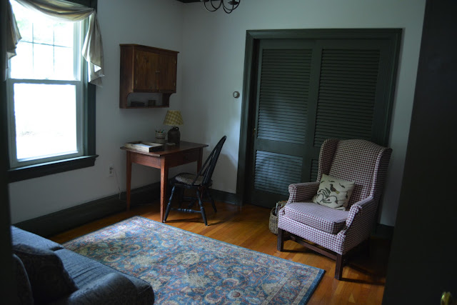
2) A desk/office area.
We definitely shopped the house for this space!
This wall cabinet was the
one that Ron built for The Farmhouse bathroom. We hung it in the
dining room here at Pineapple House, but it felt off. (Having nothing
under the cabinet made it feel like it was floating.) Now, however, it has a home.
This is right. It hangs over the desk and holds envelopes, cards, and other stationery.
The desk was also at The Farmhouse, serving as a side table in the living room. (You can see it ~
here~.) The crock lamp was in The Farmhouse kitchen. (It's ~
here~.) An old crock holds pencils and pens. In fact, the only new item in this area is the little wooden mail tray I bought at HomeGoods. (Actually, it's not a tray designed specifically for mail, but I liked it better than the mail sorter things that I found.)
Ron is using the desk for household finances. I write out cards and notes here. Occasionally Bekah does her school work at the desk. And the mail . . . well, it gets to the tray some of the time. We're still working on that.
3) A reading area.
This love seat was used hard in The Farmhouse kitchen, because that room was the hub of our home. It was the kitchen, the sitting room, the school room, the gathering room, the party room. The love seat has had a lot of use.
We're not ready to have it reupholstered yet, but it needed an update. I found a very inexpensive throw on eBay, so I am using it to cover the back of the love seat. It certainly buys us some time.
The love seat is the most comfortable piece of furniture ever! I find myself here a lot . . . having my devotions and morning coffee, blogging, and, yes, even reading!
 |
| Pinky photobombed all of my love seat pictures. :) |
We picked up this Warren Kimble print for $25 at an antique shop! Score!
My daughter-in-law Sarah took this photo of me reading to the boys while the girls were having their piano lessons with Bekah. (I was in my glory.)
4) An overflow conversation area.
As I told you in this post, I was hoping to find a wing chair to expand the function of this space to include a small gathering/sitting room. I searched Craigslist for months, but I couldn't find exactly what I was looking for (the perfect combination of style, price, and location).
I began to wonder if a wing chair would even work in the room at all. Maybe a chair would crowd the small space. Right after we finished painting, Kati suggested that we bring in the red-checked chair from the living room, just to see if it would work. Well, not only did we decide that a wing chair would work, we decided that we wanted this wing chair! Right size, right color, just enough pattern . . . no need for Craigslist!
Shopping the house can be a good thing.
Of course, to make a sitting area, you need to have a rug. And how are those little grands going to sit and play a game or do a puzzle if they don't have a cushy place to land?
Wanting to keep the cost down, I began my search locally. What do you know? I found my rug in Walmart. It is
Venetian Scrollwork in their Better Homes and Gardens line. And it was
$78, folks! Score again! It is not the quality of my
living room and dining room rugs, but this is a low traffic area and I am happy with how it looks, so it is good.
Now to give you a few more details . . .
Paint colors
For the walls, we used the same antique white that we have used in all of the other rooms at Pineapple House. I am sorry that I can't give you the exact color, but it was an old Valspar color that Lowe's no longer carries, and we have had it color matched from an old can. It is my favorite shade of white -- not too white, but not yellowy or tan.
The trim is a color from
Olde Century Colors called
Quaker Green. (We had it color matched in a Behr paint, eggshell finish, because we have always been pleased with Behr's results.)
Quaker Green is very close to the color we used in The Farmhouse dining room. Such a great colonial color! Although I prefer lighter, brighter colors in my main living spaces, a darker color like this works well in a room that is less frequently used. It also ups the "cozy" factor. :)
Window Treatments
I had planned to use a check to make a fishtail swag. But after deciding to keep the checked wing chair in the room, and considering the coverlet pattern on the love seat and the design in the rug, a check seemed like too much. Kati and I went to Hobby Lobby and we found a simple fabric that looks like linen (it isn't) that seemed just right.
Ron also made shutters for the bottom sash. This allows us to let natural light in during the day, but we can also have privacy after the sun sets. (When I took most of the pictures for this post, the shutters were not finished, so I went back a took a few more after they were in place.)
Lighting
We wanted updated lighting for the library. I found this
small bronze chandelier at
Sturbridge Yankee Workshop. Not only was it the right size for the space, it was also the right price! It was on sale and I had a discount code. We paid just a smidge over a hundred dollars for this new light.
So there you have it: our library/office/sitting room!
Yes, I am over the moon, because it turned out even better than I had imagined! It may not be on the cutting edge of home decor. But it is functional and cozy and it fits our style, and that makes it perfect for us!


